Hi everyone,
As our community continues to grow and evolve, we want to make sure our visual identity still represents who we are and what we stand for.
Before making any decisions about our branding on the new website, we want to hear directly from you! We are currently gathering feedback on our existing logo to see if it still resonates with the community, or if it might be time for a refresh.
Please take a second to vote in the poll below.
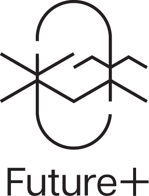
- I love the current logo! Let’s keep it exactly as it is.
- I think it’s time for a completely new design.
- I don’t have strong feelings either way.
0
voters
Have more detailed thoughts? If you have specific feedback—what you like about the current logo, what you feel is missing, or ideas for a new direction—please drop a comment below. All constructive feedback is welcome!
Thanks for helping shape the future of our community.